Estimating Travel Cost from OpenStreetMap
Traffic data at the intensity with which it is being generated isn’t feasible to store even on a monthly basis and is more applicable to real-time use cases, as most of the daily commute apps we know use it for.
However, there are instances where we need to perform static analysis, either for some research or commercial projects, and it is at this moment that we realize that there isn’t really a source of such data. There are a few companies that do provide this, but firstly, it is limited to certain regions/cities, and moreover, it would cost us, of course.
This short write-up explains how open-source data can be used as an alternative source and how something meaningful can be built out of it.
The OSM Initiative
OSM, as we know I,t is a crowdsourced platform to provide and build open-source maps for the community. Over the years, it has provided immense value in the sense that most commercial applications nowadays use OSM for most of their base maps and routing-related services.
Multiple platforms/APIs can be used to ingest the data, some of them are listed here:
- https://download.geofabrik.de/
- https://overpass-turbo.eu/
- ArcGIS OSM Editor
- QGIS QuickOSM Plugin
There are multiple categories of key/value pairs or datasets categorized into multiple classes; for this exercise, we just need buildings and highways.
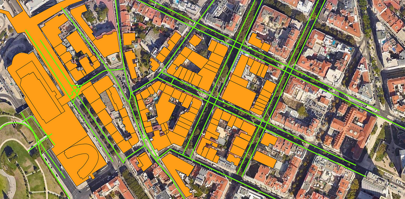
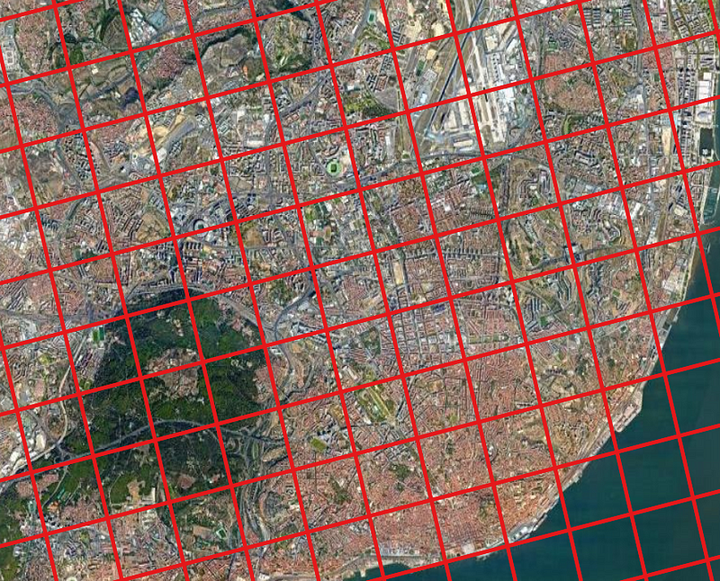
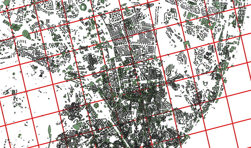
Taking an example of Lisbon, Portugal, here are a few snaps of the vector polygons from 2015 and 2021

On the left is Building/Roads in 2015 and on the right are 2021 maps. Source: Maps and Vector Data From OSM
Visually, we can infer two main things:
- The count of buildings has increased over the past 6 Years
- The road network has been modified a little as well
This could also be due to no data being available in 2015 in the OSM repository.
ESRI 2020 LULC Maps
Yet another useful source is the LULC Maps of ESRI which were launched in 2020. With the global extent of maps @ 10m resolution, we can infer the classes at the level of small sub-regions and try to estimate the surface cost for pre-defined sub-regions.
The methodology is straightforward; we can execute the following steps:
Digitize Lisbon by creating smaller sub-regions; this could be done at a Parish (official sub-regions) level also.
However, for this experiment, we will implement simple grid-based separation. The shape of these polygons can affect the way we infer the final results and it is generally recommended to use hexagonal shapes rather than squares as they are more likely to represent real geography.
The images show an example of square-based grid lines; however, in the next step, hexagonal grids were used.
Overlaying the building polygons from OSM will give a result like this.
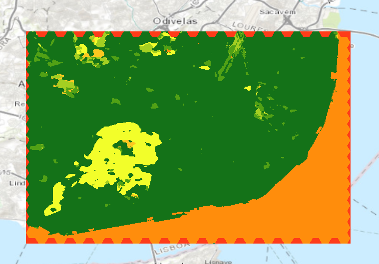
Now, we can simply calculate the mean count of buildings in each of the squares. This can be achieved by intersection or zonal statistics. Different tools have their ways to define the names for different algorithms.
While running the statistics, we may have two options:
- Average Count of Buildings in each polygon
- Average Area of Buildings in each polygon
It’d make more sense to get the average area since larger buildings could signify a larger density of people as compared to having several residential buildings which are likely to have a lower density of people. Once we run this, we get something similar to the figure below.
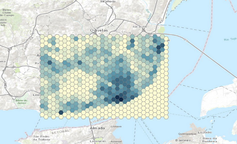
Now we have a generic idea based on the infrastructure where most people in the city would be clustered, and hence the traffic would also be centered mostly around these regions. This however,r doesn’t give us information about how tough is it to travel from maybe Hexagon A to Hexagon X.
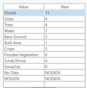
This can be inferred from one LULC map provided by ESRI in 2020. We can re-classify the LULC Maps to Cost Surface Maps. This would, for example,e mean, water gets the highest number because it’s the least preferred way to travel in an ideal world; similarly,y the Built Area class gets the lowest number as we’re assuming that this class also includes the motorable roads.
Finally, we can build a table like this.
Here’s the sample ESRI map that we get. Since the map is taken at a lower resolution and visual interpretation can identify only 3–4 classes at max and as a result, the map isn’t as useful.
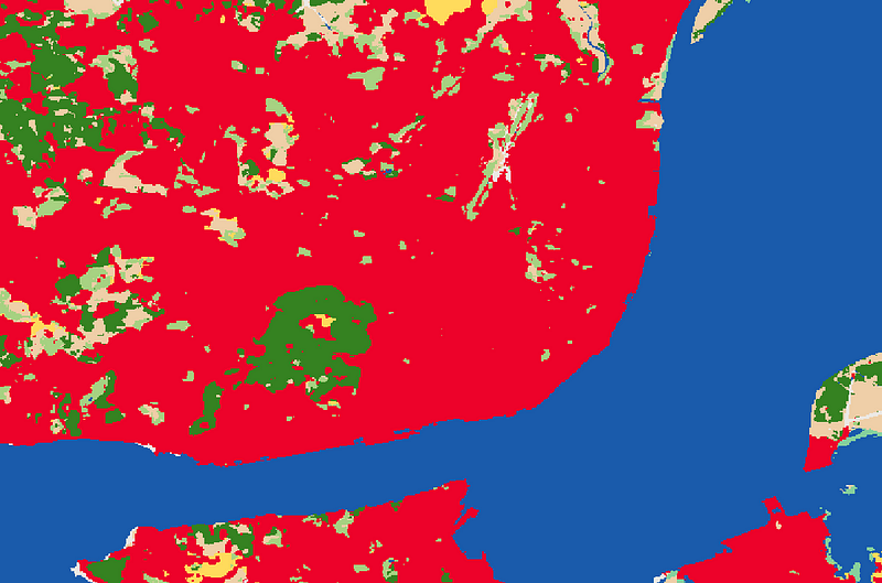
After reclassifying, we get the following image depicting the surface toughness for commuting
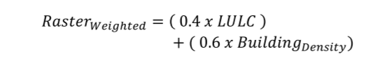
To finally create the cost surface model for our roads, we’ll develop a simple formula to give different weights to each of the two data sources. A lower weight is given to the LULC maps as the quality of information isn’t as precise as what we get from our buildings layer.
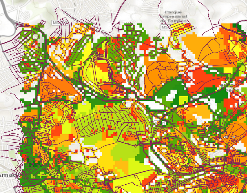
The following map is a blended raster of LULC and the building counts. A region may have a lower building count but tougher surface terrains to travel through or poor roads that look more like dirt roads; hence, in these places the cost would be higher.

After running the Path Distance Allocation tool in ArcGIS Pro, where we provide the road network as our input source, the roads are finally rasterized, and each road line shows what would be the travel cost through that area.

Here’s a much more zoomed version overlayed with the road network
There’s still a big scope of improvement in terms of what data variables can be used to give better estimates but this can be used as a headstart to traffic-related applications where data isn’t readily available.

Comments ()